
This Wallpaper Collection Will Convert Wallpaper Haters
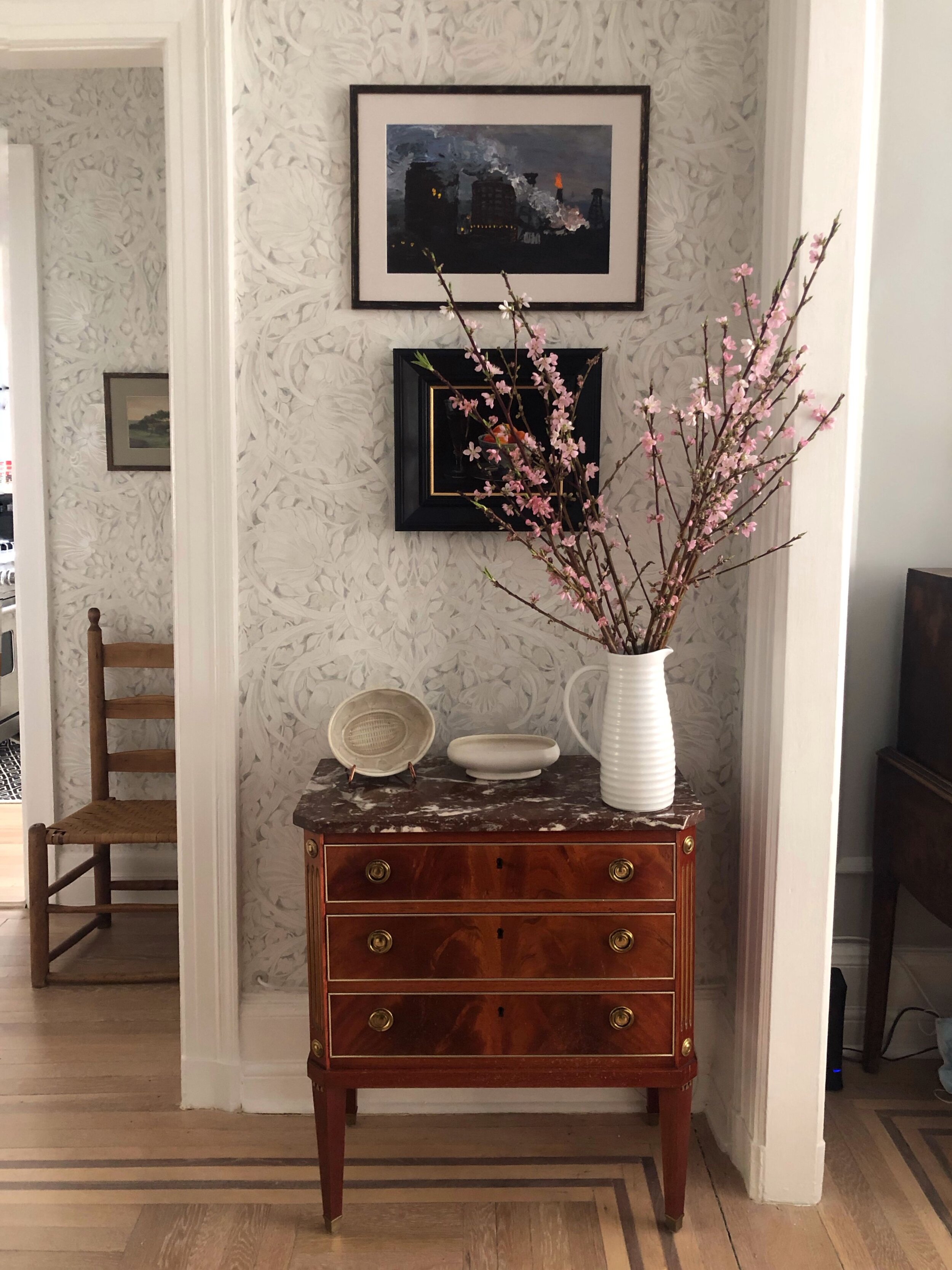
Everyone loves praise. I am no exception. Thank you to the many folks who messaged me or commented on my Instagram about their delight at my wallpaper choice and the transformation of my foyer and hallway. Repeatedly I heard that they don’t usually “do” wallpaper but the pattern I chose made them reconsider. I installed Pure Pimpernel from Zoffany’s Pure Morris Collection (available from Morris & Co. in the UK) after testing countless wallpaper samples and posting numerous inspiration rooms on Instagram.
Here are 3 reasons why the Pure Morris Collection wins over people who say they don’t like wallpaper
First, the required disclaimer: this post in sponsored because after I embarked on the great wallpaper debate, Zoffany took notice and offered to provide the paper gratis. Let me assure you, however, that Pure Pimpernel was my first choice independent of the deal.
1. It’s a Classic
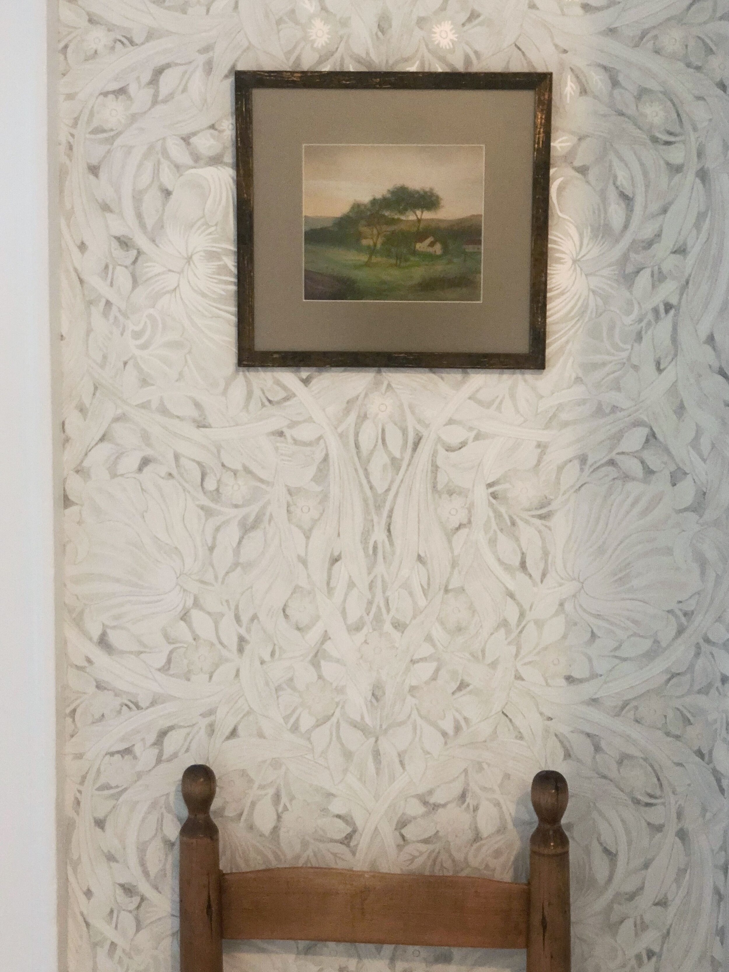
Many people shy away from wallpaper because they fear it will soon look dated. Indeed, some of the more whimsical patterns I sampled could well be a passing fad. The Pure Morris Collection is different. There are no trends here. William Morris designed these patterns over 100 years ago and they have been in continuous production ever since. You can’t argue with longevity. These patterns are timeless and simply won’t go out of style.
2. Scale
The scale of the patterns in the Pure Morris Collection are either quite large or quite small. You want that if you are going for a subtle look. Unlike a paper in the middle range that shows a lot of the ground color, no element of the wallpaper in the Pure Morris Collection will scream at you. This subtlety was the main reason wallpaper haters said they loved my Pure Pimpernel.
3. Neutral Palette
Think fashion. There is a reason you have a lot of black, white, camel and gray in your wardrobe. It goes with everything and the Pure Morris Collection is the same. Many commenters noted that while they love William Morris’ patterns, the colors were often too strong for them. The Pure Morris Collection solves that problem. It works equally for people who like an overall neutral palette or, if like me, you want something that ties together more vibrant rooms.
While the Pure Morris Collection is neutral, it is decidedly not boring. Like a well done “all-white” décor scheme, the collection adds texture by introducing metallic highlights to William Morris’ classic patterns. The touches of sparkle are made by using glass shards and metal ink, a nod to Morris’ love of handcraft.

Conclusion
For me, Pure Pimpernel was the perfect choice for all three of these reasons. Budget wise, I need to live with this wallpaper for a long time. Moreover, when you nail the scale, it is easy to hang art on wallpaper, and I have a lot of art. I didn’t want the wallpaper itself to steal the show but rather provide a backdrop that enhanced my paintings. Finally, the neutral tones were a perfect bridge connecting my colorful spaces.
This is what my foyer and hallway looked like before.

And voila: here is the after.

Take a look at some other gorgeous patterns from the Pure Morris Wallpaper Collection. By the way, there are similar fabrics too.


Credits: Photos of my apartment by Lynn Byrne. Other images by Morris & Co.